A visitor lands on your site, reads a lovely story about the estate, watches a drone shot of the vineyard at golden hour, and clicks "Shop." Then they hit a grid of forty bottles that all look roughly the same, and they leave. Not because your wine is wrong for them, but because they couldn't tell which one was.
This is the quiet failure point in most winery ecommerce: the site does a good job of building interest and a poor job of helping someone act on it. The wine list is where curiosity is supposed to become a cart, and it's also where the most buyers slip away.
The good news is that the drop-off is rarely about taste or price. It's about friction, ambiguity, and unanswered questions, all of which you can fix without rebuilding your site.
The wine list is a decision, not a menu
A restaurant menu works because a server fills the gaps. They read the table, ask what you usually drink, and steer you. Your shop page has no server. It's a menu asked to do the server's job, and most winery ecommerce templates aren't built for that.
Buyers arriving at the list are carrying a specific, unspoken question: which of these is right for me, right now? Maybe it's a gift for a father-in-law who "likes big reds." Maybe it's something to bring to dinner Friday. Maybe they loved a bottle in your tasting room six months ago and can't remember the name. The list, as most sites present it, answers none of that. It just displays inventory and waits.
When a page asks a shopper to translate a fuzzy human need into the right SKU with no help, a meaningful share of them simply won't. They'll tell themselves they'll "come back later," and later rarely comes.
The failures that quietly cost winery ecommerce sales
These show up on shop pages of every size and platform, from Shopify to Commerce7 to Squarespace. None of them look like emergencies, which is exactly why they persist.
An undifferentiated grid
Twelve to fifty bottles, near-identical label shots, and a name plus a price. Nothing signals what makes each wine different or who it's for. The shopper's eyes glaze, and choice paralysis does the rest.
Product pages that describe the wine but don't sell it
Tasting notes written for a sommelier ("brooding graphite, crushed violet") tell an everyday buyer almost nothing about whether they'll enjoy the bottle or what to serve it with. Thin, jargon-heavy pages are a top reason carts never get started. Writing pages that speak to real buyers — and that also give your tools something to work with — is its own discipline.
Dead ends on out-of-stock and sold-through vintages
A shopper clicks the exact wine they wanted and lands on a grayed-out "Sold Out" with no next step. That's not a limitation of inventory; it's a missed handoff. Every one of those pages should offer the closest available alternative or a back-in-stock option.
No way to ask a question in the moment
Buyers have real questions at the point of decision: Is this club-eligible? Can you ship to Texas? What pairs with the Syrah? Do you gift wrap? When the only answer is a contact form and a promise to reply "within one business day," the sale cools before the reply ever arrives.
A mobile experience built for a desktop that no one's using
Much of DTC wine browsing happens on a phone, often on the couch. Tiny filters, a checkout that demands an account, and pinch-to-zoom tasting notes turn a warm lead cold fast.
Fix the list first: make it decision-ready
Before adding anything new, make the existing list do more of the server's job. A few changes carry most of the weight:
- Lead with the buyer's language, not the tasting-room lexicon. Add a one-line "good for" cue to each product card — "weeknight red," "crowd-pleasing white," "special-occasion Cabernet." It costs nothing and instantly reduces the translation the shopper has to do.
- Give the grid real filters. Not just varietal, but occasion, price band, sweetness/body, and "ready to drink now vs. cellar." Filters are the closest a static page comes to asking, "What are you in the mood for?"
- Rewrite the top of each product page for a human. Keep the poetic notes lower down, but open with who the wine is for, one honest flavor cue, and a pairing or two. This is also what feeds any AI or search layer you add later.
- Never let a page dead-end. Out of stock should always surface the nearest substitute, and sold-out vintages should route to the current release.
If you want a broader framework for these mechanics, our field guide to ecommerce CRO for beverage brands goes deeper on the testing and layout side.
Add guidance where the questions actually happen
Better filters and copy narrow the field, but they can't have a conversation. The shopper who wants "a red for someone who loves Napa Cabs but under $40" is asking a question no dropdown answers cleanly. This is where conversational guidance earns its place in winery ecommerce.
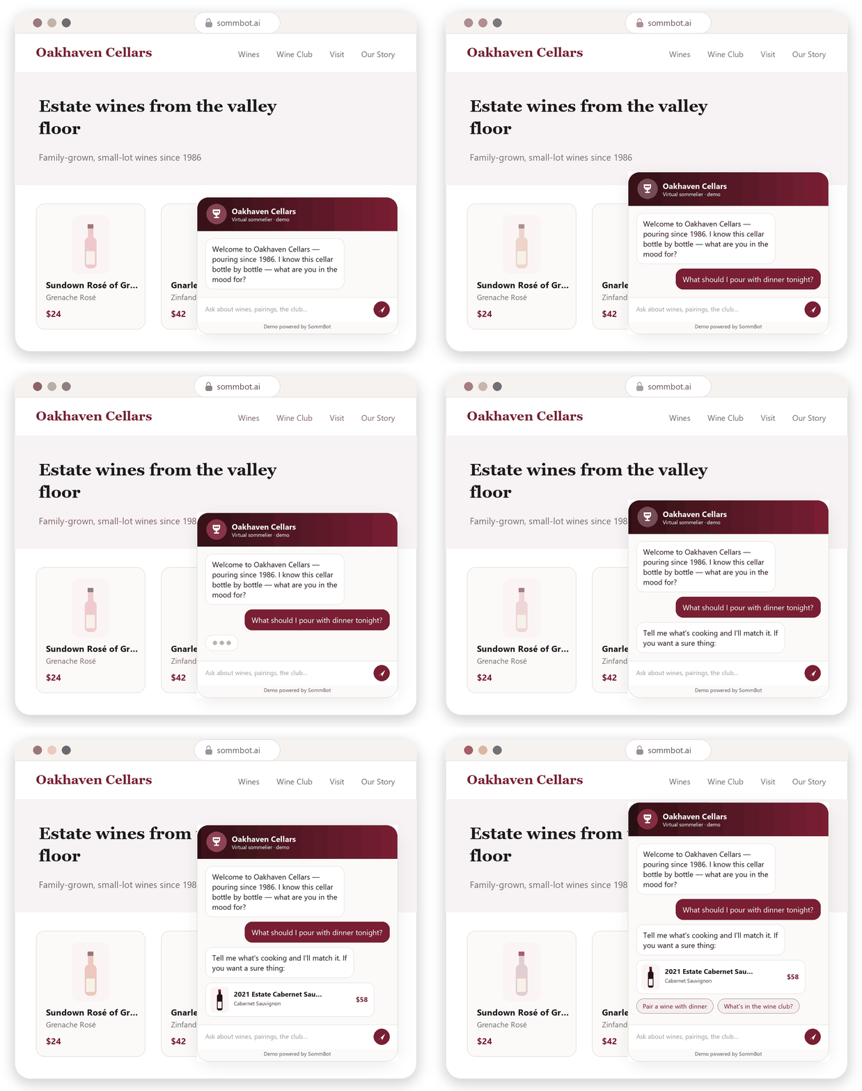
The idea behind AI-guided selling is simple: instead of making the shopper decode your catalog, let them describe what they want in plain language and get a real recommendation back. Done well, it's the digital version of the tasting-room host who asks two questions and hands you the perfect bottle. This is exactly the role of an AI sommelier — and answering the perennial "what pairs with this?" question at scale is one of its highest-value jobs.
The critical caveat: guidance is only as trustworthy as its guardrails. A tool that invents a vintage, misquotes a price, or makes a health claim does more damage than no tool at all. This is why SommBot answers only from a winery's approved catalog and content — real inventory, real prices, the brand's own voice — and hands off to a human when a question falls outside what it's been given. It backs up your staff instead of guessing on their behalf.
Rescue the edge cases you're currently losing
A surprising amount of winery ecommerce revenue hides in the moments most sites treat as afterthoughts:
- Shipping and compliance questions. "Can you ship to my state?" is a make-or-break question, and a slow answer is a lost order. Surface shipping eligibility clearly, and let shoppers confirm it before they fall in love with a bottle you can't send.
- Gifting. Gift buyers are motivated and time-pressed. If they can't quickly find wrap options, a message card, or a "pick something in this range for me" path, they'll buy elsewhere.
- The after-hours shopper. A lot of browsing happens long after the tasting room closes. Questions asked at 10 p.m. that go unanswered until morning usually don't convert.
Each of these is a place where a real-time answer, human or automated, converts a hesitation into a sale.
Watch the right signals
You'll know the fixes are working not just from total revenue but from the shape of behavior: fewer bounces off the shop page, more product-page views per session, higher add-to-cart rates from the list, and fewer "do you ship to…" emails arriving after the fact. If shoppers are asking questions and getting answers on-site, you'll see it in engagement before you see it in the monthly total.
The takeaway
Your wine list is the busiest, highest-stakes page on your site, and on most winery ecommerce stores it's doing the least to help people buy. Make the list decision-ready, write product pages for humans, close every dead end, and add real guidance where the questions live. None of it requires a rebuild — just a shift from displaying inventory to helping people choose.
If you'd like to see what conversational guidance looks like on a real catalog, book a SommBot demo and watch it answer pairing, shipping, and club questions in your brand's own voice.